PROJECT OVERVIEW
PROJECT OVERVIEW
Client: Forbie
Duration: 14 days
Team: Yellow Pebble
Status: Shipped
My Role: UI/UX Designer, Brand Designer
Tools: Figma, Photoshop, Illustrator,
Deliverable: Website design, Brand Identity Optimization

Forbie® is a group of technologists and healthcare professionals deeply passionate about transforming cancer care. Forbie® produces digital applications to bring knowledge, network, and resources to solve problems that inhibit the patient experience.

The Problem
How do we create new VISUALS for A oncology Startup?
Forbie®’s goal is to transform the cancer care journey of patients and survivors away from traditional oncology care. Therefore, we want to bring a sense of comfort, and reliability to our visual languages. Therefore adding a blue color palette, and soft color gradient comes to mind.
The Solution
Create a soft and TRANQUIL brand outlook.
Forbie® is here to transform the cancer care journey of patients and survivors. Therefore, the biggest challenge was to transfer the brand’s appearance from the classic mundane, clinical bureaucratic designs into the plane of soft modern design.
Design Process
I started looking for brand motifs by looking into many symbolism from oncology. We like how the organic shapes resemble human cells, and their rough shapes paired with color gradients add a layer of friendliness to the improved brand identity.


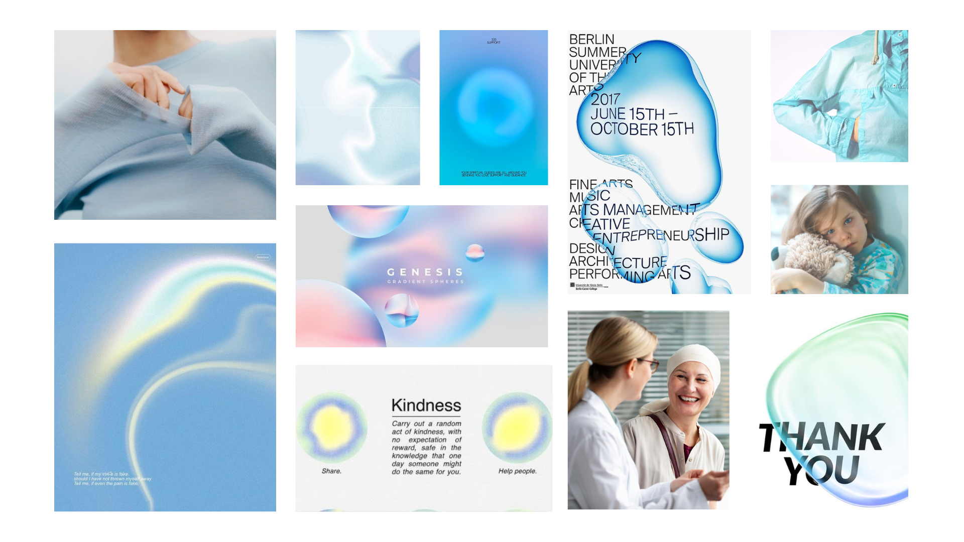
We took the original brand color blue, and decided to add other colors to create soft gradients. The free-formed blue shapes convey the organicness of the human body and the ever-shifting of medical fields. The gradient color creates a smooth and soft visual language, in contrast to the traditional corporate brand identity that medical company often used.
Moodboard
Final Product


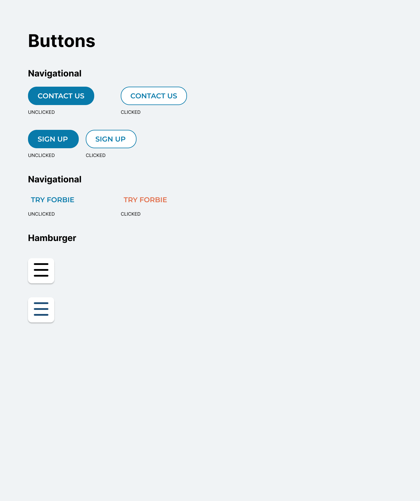
UI Kit
I created a UI kit of my team and I are able to access the assets to keep the design consistent.