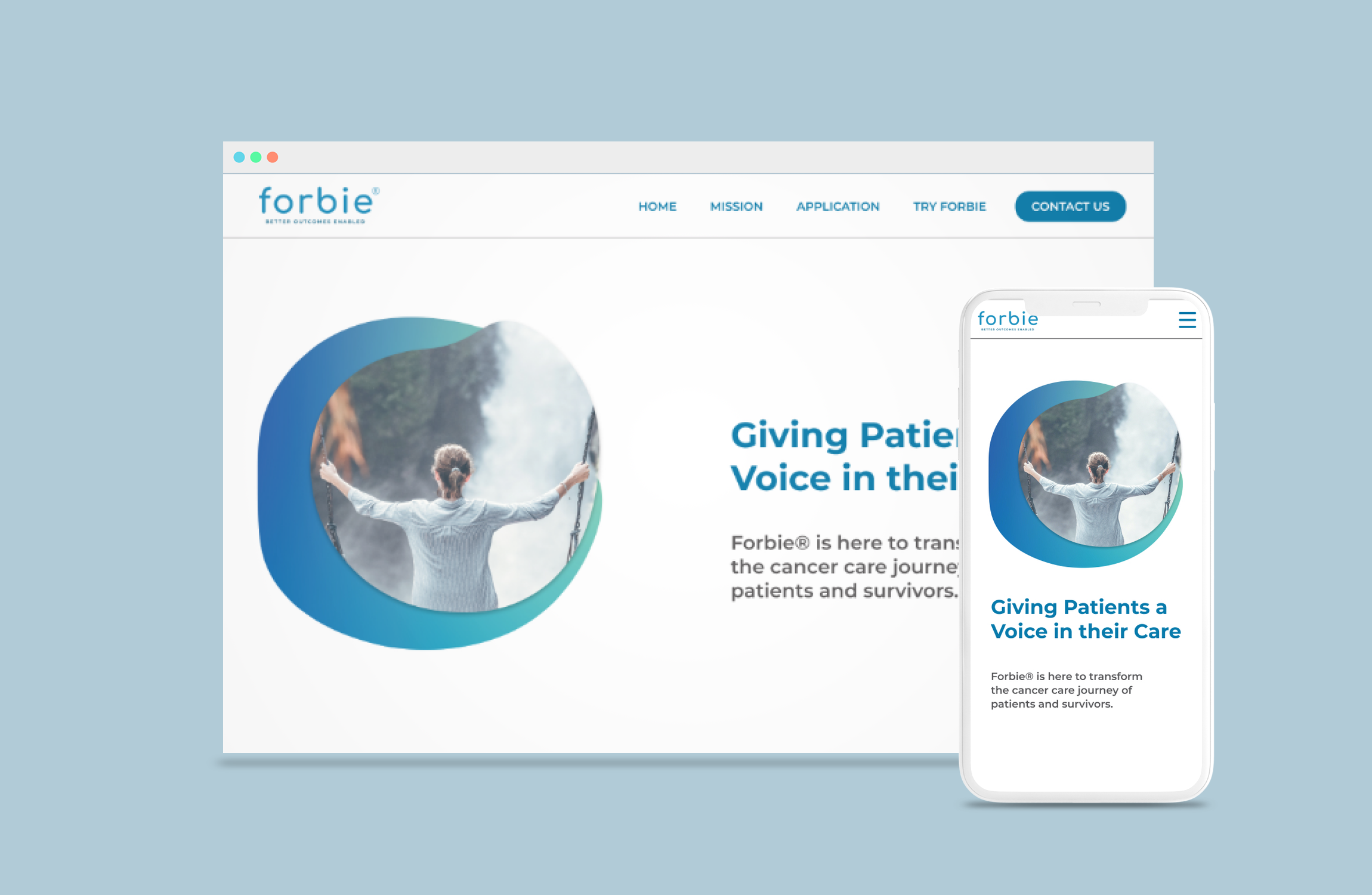
UI, BRANDING
Forbie
Project overview
-
Forbie® is a group of technologists and healthcare professionals deeply passionate about transforming cancer care. Forbie® produces digital applications to bring knowledge, network, and resources to solve problems that inhibit the patient experience.
-
Forbie®’s goal is to transform the cancer care journey of patients and survivors away from traditional oncology care. Therefore, we want to bring a sense of comfort, and reliability to our visual languages. Therefore adding a blue color palette, and soft color gradient comes to mind.
-
Figma, Photoshop, Illustrator
-
UI/UX Designer, Brand Designer working for Yellow Pebble
-
14 days
-
Shipped
How might we create a sense of comfort for cancer patients
The biggest challenge was to transfer the brand’s appearance from the clinical bureaucratic designs into the plane of soft modern design.
I started looking for brand motifs by looking into many symbolism from oncology. We like how the organic shapes resemble human cells, and their rough shapes paired with color gradients add a layer of friendliness to the improved brand identity.


