UI,UX
OH LALA MY PANDA
Project overview
-
In the summer of 2019, Galeries Lafayette Mall Shanghai collaborated with Oh LaLa My Panda for a public art exhibition where Panda art statues would be displayed inside the Mall. Over the course of 10 days, my team and I designed and prototyped an interactive information experience on Galeries Lafayette’s WeChat Mini Program for all 20 displayed pandas statues.
-
Galeries Lafayette Shanghai
-
Figma, Photoshop, Illustrator, WeChat, Adobe XD
-
UI/UX Designer, Graphic Designer
Working with
Yanxi Zhang — Design Lead
Emma Chen — Graphic Designer
Fashion Zoo Marketing Department
-
10 days
-
*Published on Wechat from 2019 July 5th to 2019 August 31st
Problem
It’s harder to advertise to people with shorter attention spans.
When on the phone, people usually look for a specific piece of information, yet can easily be distracted by their environment. These factors make creating ads on APPs quite difficult. This sparked the question: how might we create informative Ads that can be enjoyed in a short amount of time?
Solution
skimmable UX IS the key to advertisement success.
Design Process
When on the phone, people usually look for a specific piece of information, yet can easily be distracted by their environment. These factors make creating ads on APPs quite difficult. This sparked the question: how might we create informative Ads that can be enjoyed in a short amount of time?
Contexts (important)
What is the WeChat Mini Program?
WeChat Mini Programs are “sub-applications” within the WeChat ecosystem. This type of system enables the WeChat platform to provide advanced features within its WeChat official page. The most common features are task management, e-commerce services, coupons, etc.
Define
We started the first step in the process by answering the 5 W questions according to the design prompt given.
Ideate
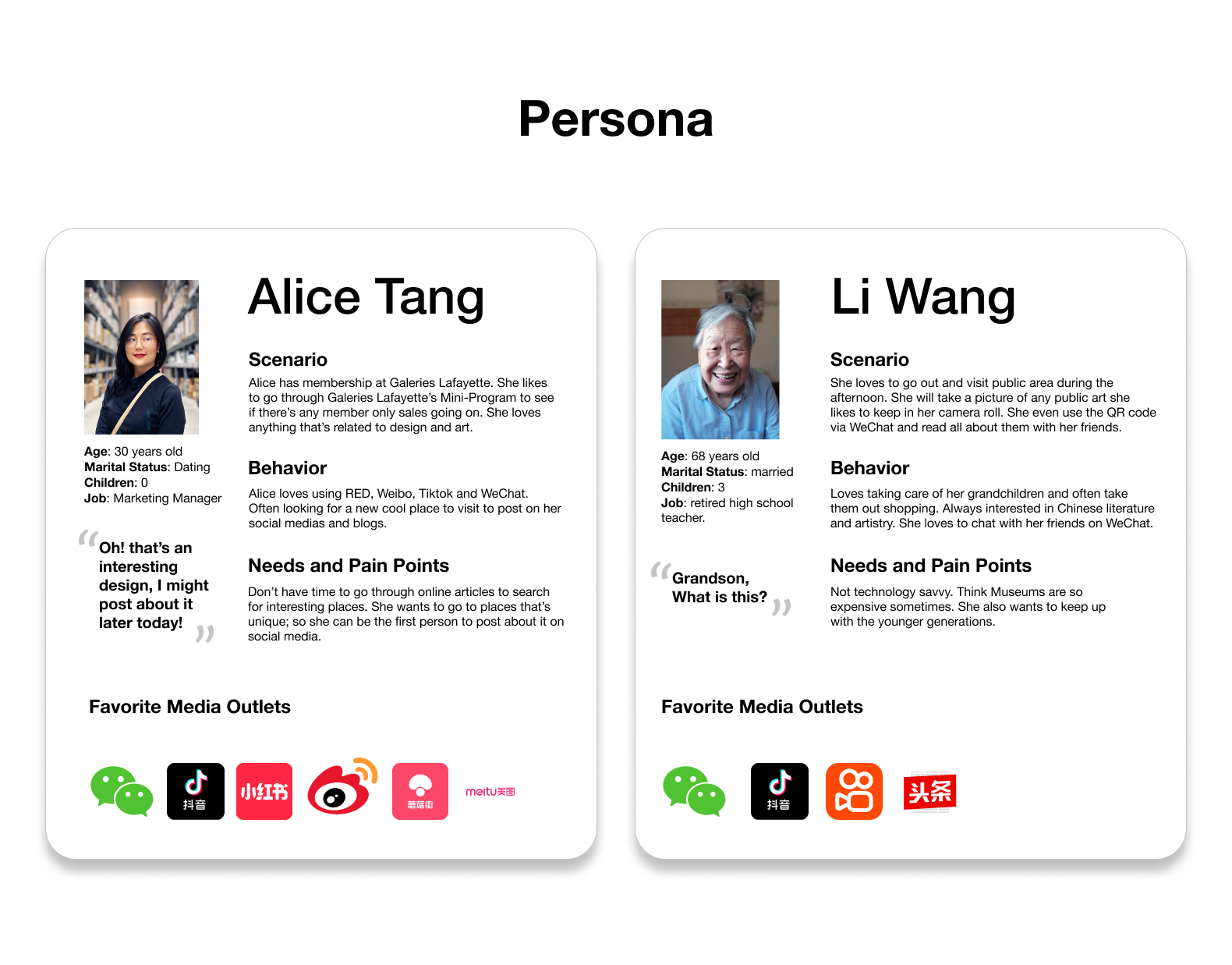
The next step was conducting a quick competitive analysis to determine the pros and cons of other similar Mini-Program. From there, we created user personas and user interviews/observations to better understand our users’ needs and goals.
Our main takeaways from this stage include:
Sharing features should be included to encourage and allow users to spread their knowledge.
Information should be easy to find on the home page.
Navigation should be simple and intuitive.
Design
Next, we sketched low-fidelity wireframes with pencil and paper. After we agreed on the general layouts of our screens, we turned to Figma for our mid-fidelity wireframes in order to save time. We used these mid-fidelity wire frames and asked 3 of my co-workers (who are similar to our personas) to go through them and gave us feedback for next iteration
IMPROVEMENT
Based on various feedback from 2 other peers and mentors feedback, I continually iterated my design over the span of 2 weeks- with 3 major improvements,
UI Design
In our Figma file, we compiled all of our UI components, colors, icons, and typefaces in the styles guide page of the file. This style guide helped us to build interfaces.
8-Point Grid
With a mobile-first approach, I designed using a 4-column and 8-point grid system. This helped me define the spacing system and ensured the consistency of design and spacing for brand personality.
Typography
We chose Noto sans for its accessibility and clean designs in different languages. The fonts are free to use, making it easy and beautiful type for modern communication.
Color
To create a vibrant and on-brand color system, I took inspiration from trendy colors in Shanghai, which were green, yellow, and purple in the summer of 2019. Another inspiration came from the theme of Panda and nature.
Illustrations
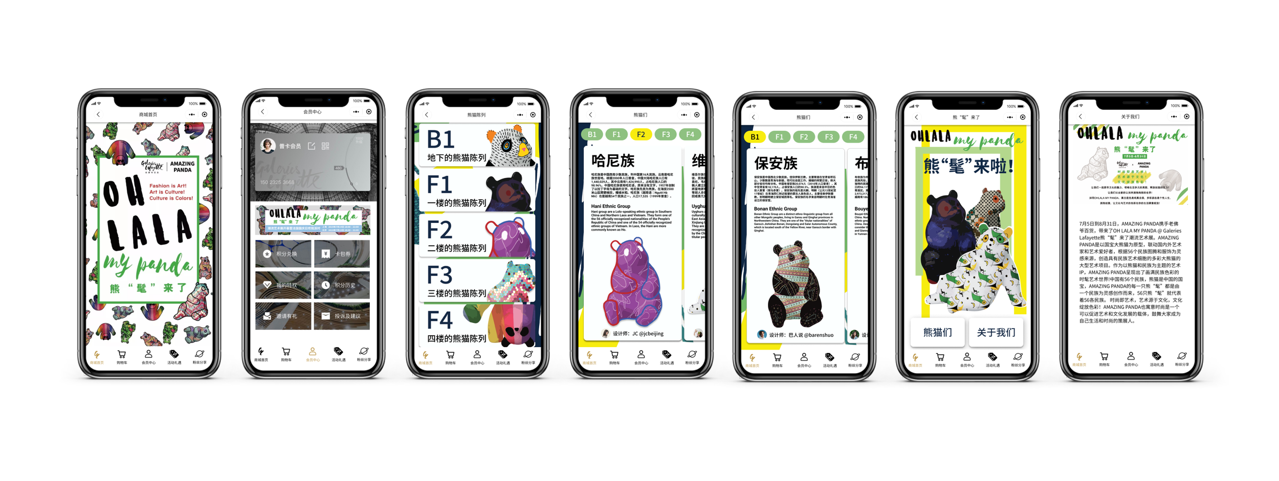
OH LALA MY PANDA was an exhibition show about pandas, and each panda had unique pattern designs that are inspired by Chinese ethnic minorities’ traditional fashion garments with a splash of modernity. This exhibition show was aimed at bringing fashion, design, and Chinese culture together.
UI Component
I used our panda illustrations in UI component to great an unique and informative graphics.
Final Design
Interactive Mockup
Reflection
Working on this first project taught me the importance of usability testing. Hence, going forward I believe focusing more on the insights will improve my storytelling abilities for others.
If I had more time…
Further explore the in-mall QR scanning experience.
Explore user experience for the elderly or people who are visually impaired.
Explore more personalized features like the Heart Button, be more potential detail component, etc.


