FLAVORS WE CHERISH MEET THE NUTRITION WE CRAVE
Bowlcut
COMPANY
Bowlcut Sauce
ROLE
Designer
Tools
Adobe Illustrator Adobe Photoshop
YEAR
2022
"This is us. The rice eating, comic book reading, new wave listening, and yes, bowlcut rocking, children of modest immigrant families."
The name “Bowlcut” is a playful cultural wink, referencing a shared childhood haircut among Asian Americans and reinforcing their fun, community‑driven identity. Founded by Crystal Ung, with a heritage rooted in their family’s SoCal Chinese restaurant, "Bowlcut" is a nod to their upbringing as “restaurant kids”
They view food as natural medicine, crafted with real, recognizable ingredients, no artificial dyes or additives.
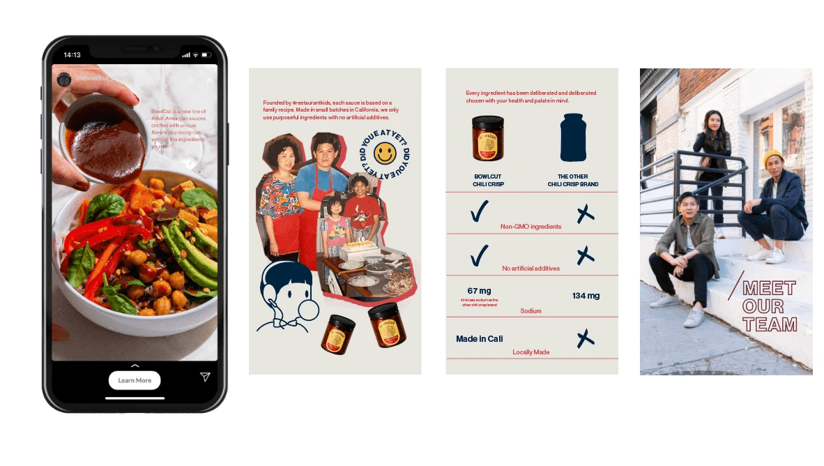
Business Objective
To strengthen Bowlcut’s brand identity and increase consumer engagement by creating culturally resonant, character-driven visuals that reflect the brand’s playful tone, celebrate unique Asian American experience to differentiate the product in a competitive, health-conscious sauce market.
Disciplines
Brand Illustration
Content Creation
Impact
Elevated engagement levels by 15%, driving deeper user interaction.
Improved site visits by 10%, resulting in stronger brand visibility and conversion potential.
RESEARCH
Understand the Brand Position
Bowlcut positioned as the first Asian American sauce brand instead of just Asian-inspired condiments, emphasizing health, and culinary heritage. The sauce brand has strong storytelling through culinary pride.
RESEARCH
Cultural Pride Served with a Side of Shared Memory
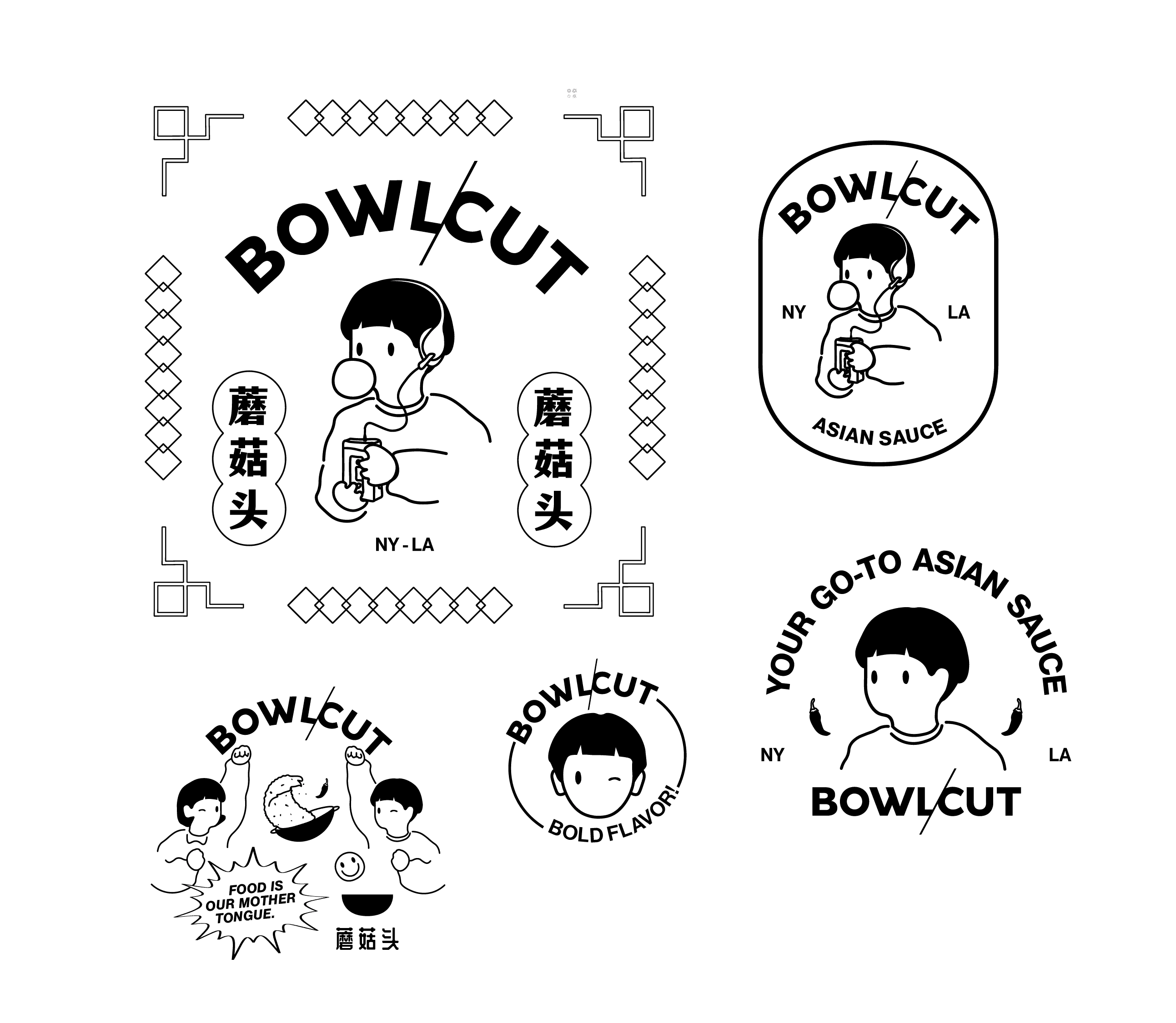
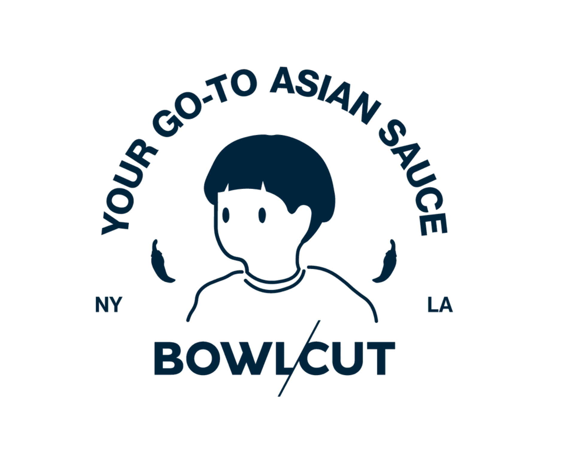
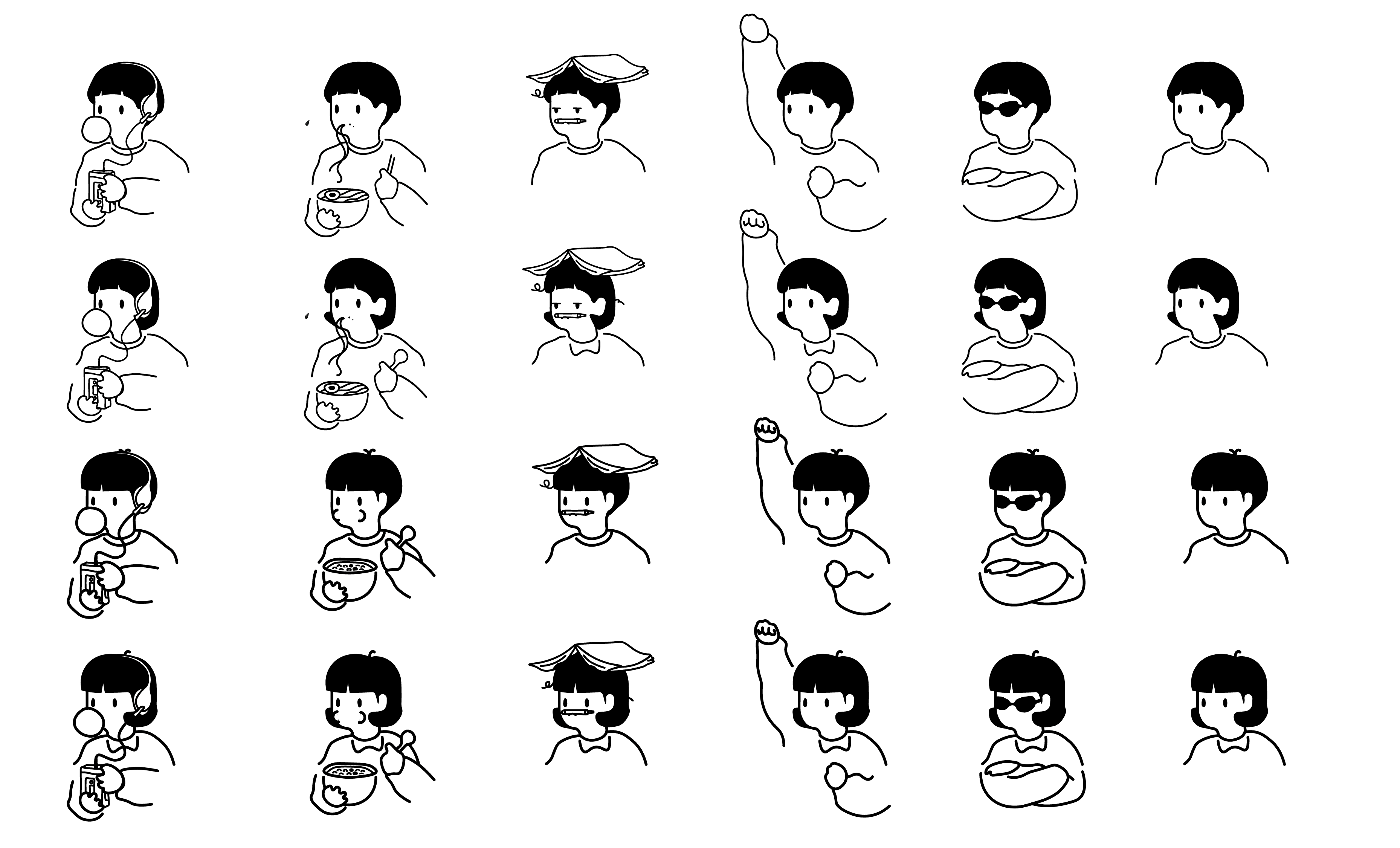
The backbone of this project began with the playful identity behind Bowlcut — a hairstyle that instantly evokes a shared memory for many Asian Americans: that iconic childhood haircut, blunt and uniform, often immortalized in family photo albums.
Inspired by this cultural wink, I designed a series of cartoon characters that served as brand mascots. These characters weren't just visual flourishes; they were vessels of community storytelling, representing a fusion of unique memories, humor, and modern identity.
SKETCHING
The Bowlcut
Let’s create a visual representation that resonates with people who had similar childhoods, or who know someone who reminds them of a 'Bowlcut Kid' from the 80s.
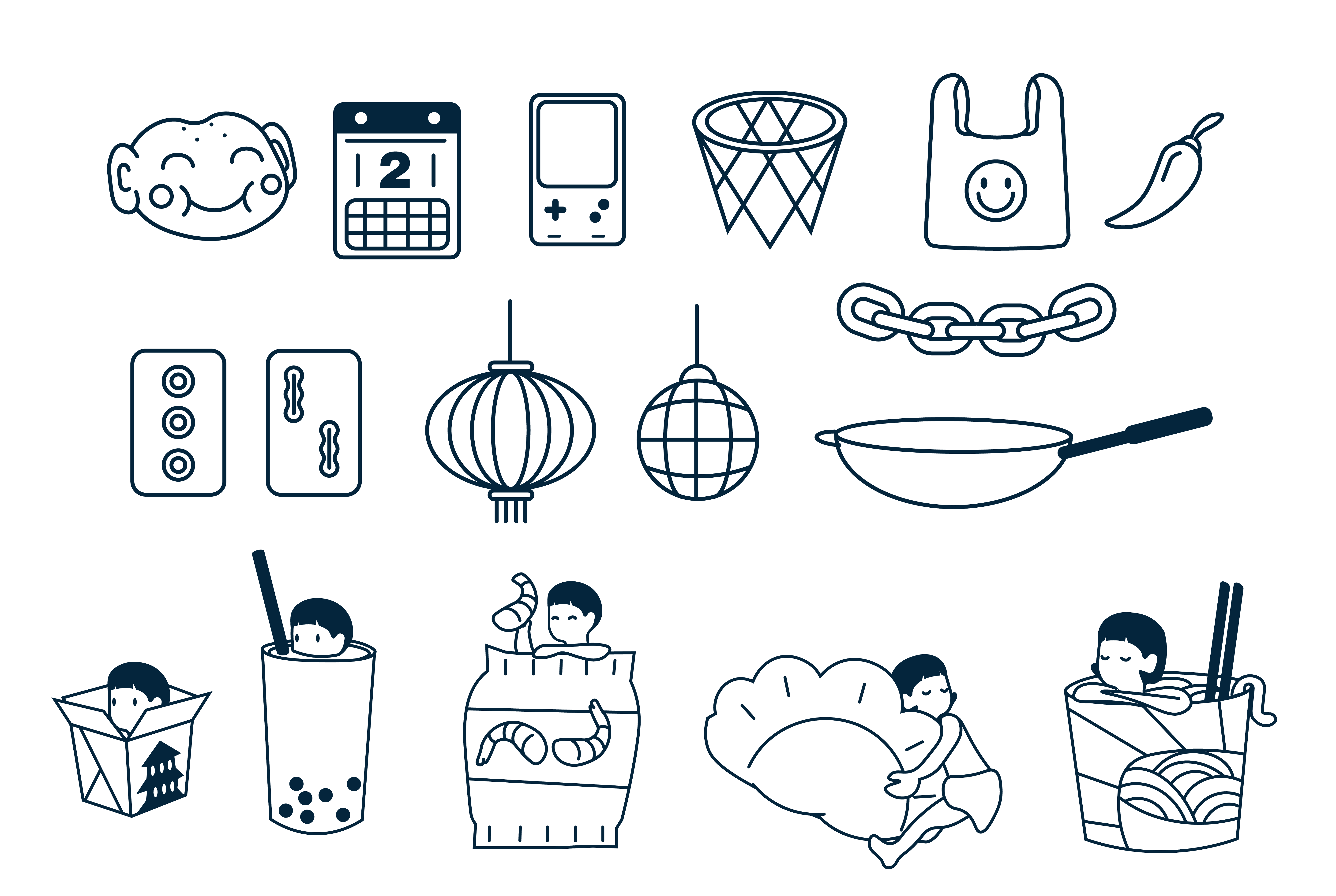
I spent hours sketching, refining, and researching. I drew inspiration from vintage 1980s cartoons and the clean, modern illustrations often found on rice bag packaging. I was building a visual language that blends nostalgia with freshness. The characters became a key part of our storytelling, appearing across social media and early product promotions to spark recognition and nostalgia.
The characters also became a vehicle for community engagement. Our character-driven content invited the audience to respond, remix, and reflect on their own childhood experiences. The playful tone of Bowlcut gave us permission to be earnest and silly at once.
ITERATION
Results
Today, these illustrations live across Bowlcut’s branded content, helping to shape a unique visual voice that feels familiar and fresh, fun yet intentional, just like the sauces themselves.