SCHEDULED GROCERY PICKUP FOR STUDENTS
GreenShelf
COMPANY
Anabel Grocery @ Cornell University
ROLE
UX Researcher Prototyper
Tools
Figma Google Suite Adobe Illustrator
YEAR
2024
"Grocery shopping in the suburbs is tough without a car—it's either a long bus ride or an expensive Uber."
College students often cook for themselves but face transportation, budget, and schedule barriers. Existing solutions like Uber and Instacart are expensive, while TCAT is unreliable. Like many suburbs in North America, the area is heavily car-dependent, despite having bus services. The lack of affordable, fresh groceries nearby negatively impacts students' health and well-being.
To address this problem, we looked at existing systems and discovered that student-run programs like Anabel's Grocery have already been working to solve these issues through traditional approaches - starting an on campus grocery store at Cornell. Anabel's Grocery raises awareness about the connection between quality food, health, justice, and sustainability. However, it closes quite early, making access to this important resource challenging.
Business Objective
Designed a solution to make grocery shopping more accessible, convenient, and affordable. This project was later pitched as a potential initiative for Anabel’s Grocery to expand its role in promoting sustainable food access.
My Role
I contributed to user interviews, SWOT analysis, task flows, and created functional prototypes in Figma. After conducting UX research, I led the UI design for prototyping, storyboarded interactions, debugged issues, and iterated based on usability testing.
Throughout this process, I collaborated with my team on heuristic evaluations, edited video walkthroughs, and synthesized user feedback into actionable design changes.
Impact
Usability improved across all 4 tasks (browsing, buying, pickup, refund)
Prototype addressed all 3 user priorities: convenience, affordability, and access.

RESEARCH
Time to chat
We began by conducting contextual interviews (8 participants) while accompanying them on real grocery trips.
Questions we asked:
How do they shop?
What challenges exist?
What are their coping strategies?
RESEARCH
Key Insights
By defining project specs, we also prevented scope creep. The cross functional partners that I have interviewed and worked with include:
A large part of this project was researching potential users to understand their current behaviors and key pain points. Through interviews and surveys; I found that 80% Students rely on limited workarounds (friend's car, walking). Interviewees' grocery shopping trip decisions influenced by cost, weather, and timing. Most of the people will focus on affordability and schedule flexibility over product variety.
RESEARCH
Market Research
We started with a SWOT analysis of current products that can solve the student shopping problems in Ithaca, to help us better understand the design opportunities.
SYNTHESIS
Personas
We created persona to better present our user groups
IDEATION
Design Opportunity
How might we create a grocery shopping experience that is affordable, accessible, and convenient for international students without cars?
IDEATION
Design Solution
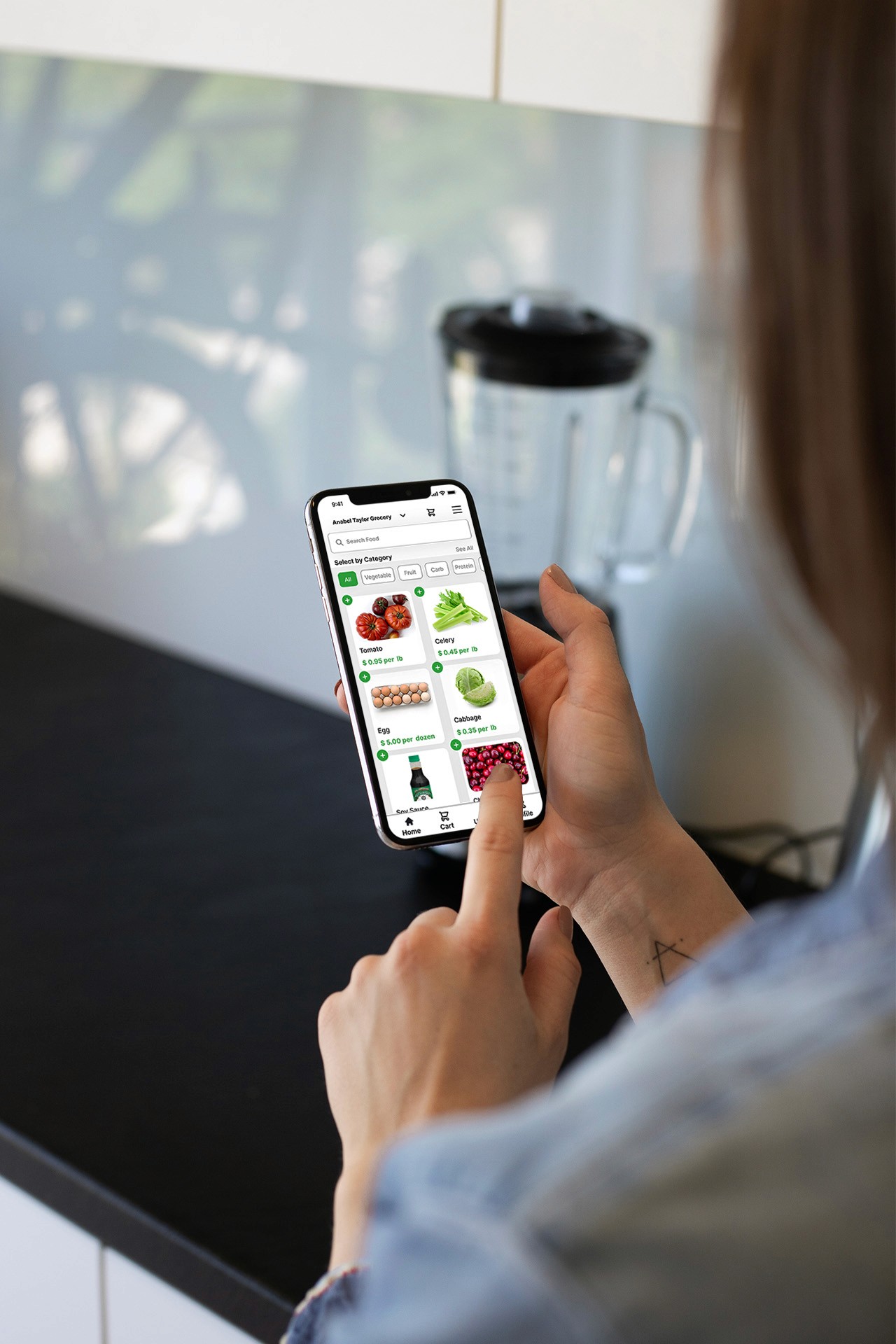
Grocery Locker System + Shopping App
Shop surplus items from Anabel’s Grocery via app
Store items in refrigerated lockers on campus
Users unlock with QR code or student ID anytime within limited days
IDEATION
Features we are going to include
📦 Browse Groceries – Students can easily view available items in real-time, improving planning and decision-making.
⏱️ Place an Order – Students can conveniently purchase groceries using Big Red Bucks.
🚪 Locker Pickup – Students can pick up their order after class and head home with groceries.
💬 Request Refund or Give Feedback – Post-purchase support allows students to report issues or share feedback for continuous improvement.
These four features focus on addressing accessibility and scheduling challenges. By leveraging Anabel’s Grocery’s inventory, we can tackle affordability through lower pricing. Reducing the need for travel also helps students save on transportation costs. All student need to do is
IDEATION
Wireframes informed by use cases
I mapped out 6 key use flows based on the persona’s core needs and pain points. These use cases translate to specific functionalities of this product: input today’s entry, autofill missed days, scroll through and favorite memories, search memories, and export the journal.
IDEATION
Visual identity and branding
As a grocery shopping app, we aimed for a brand language that communicates sustainability and freshness. The clean visuals serve a utilitarian purpose, presenting shopping items clearly and intuitively.

ITERATION
Is Our Solution Working? Time To Do Some Usability Research
We decided to invite several users to test our new designs by completing a set of tasks. At the end, we’ll ask follow-up questions to assess their satisfaction and overall experience.
Test Criteria
We conducted usability tests with think-aloud protocol. We will look at
📊 Completion Rate – Tracks the percentage of users who successfully finish key tasks in the flow
⏱️ Time to Complete – Measures how long it takes users to complete a task, helping identify friction points
🚧 Drop-Off Points – Highlights where users are exiting or getting stuck during the experience
💬 Confidence Score – Captures how confident users feel after completing each task. We will also ask them to score their outcomes.
ITERATION
Asking the Right Questions
By keeping the interactions straightforward and minimizing system response time, we focused on testing the task flow and overall usability. Instant feedback was prioritized to maintain efficiency during user testing.
We asked the users to complete five tasks, and here are the results we gathered:
Task 1: Browse
What Worked | What Didn't Work |
|---|---|
Users responded well to conventions borrowed from platforms like Amazon or Instacart (Jakob’s Law). The ability to search or filter by category or product type was helpful and familiar, supporting quick browsing. | A participant expressed frustration about not being able to easily go back or undo an action. |
Task 2: Buy
What Worked | What Didn't Work |
|---|---|
Visibility of cart contents and the ability to continue shopping or checkout improved clarity and control. Users found the receipt-style checkout intuitive and easy to follow (Natural Mapping). | Some users were concerned about the ability to easily change or delete items in the cart. |

Task 3: Pickup
What Worked | What Didn't Work |
|---|---|
The option for an alphanumeric code provided reassurance and flexibility. | Having individual QR codes on lockers caused overcomplexity; users found this unclear. |
Task 4: Feedback
Header 1 | Header 2 |
|---|---|
Users found the structured help sections and search bar effective in navigating support issues. A clear list of past orders with refund/replacement options made it easy to resolve problems. | Some users were confused about whether to request a refund or replacement, when the UX writing is quite ambiguous with choice offering. |
Changes made
Improved cart design with +/- quantity and visual feedback
Enabled item-specific refund/exchange
Added color-coded navigation and better system visibility
ITERATION
Results
80% of users rated the new feature as 'easy to use' in post-test surveys.
Participants reported less confusion during testing and appreciated simplified flows.
NEXT STAGE
Reflection
What I learned:
The value of contextual research, how constraints shape design, importance of prototype fidelity.
What you'd do next
Test in real life purchase user flow setting, partner with Anabel’s or Cornell Dining, explore more on order pickup experience.