AI-POWERED NETWORKING ASSITANCE
Timing Networking CRM
COMPANY
Timing.LLC
ROLE
Product Designer
Tools
Figma Excel Google Suite
YEAR
2025
"When is a good time to reach out and how do I keep this connection going?"
At Timing, I led the design of a lightweight CRM tool built specifically to help students, recent graduates, and job seekers organize and maintain professional connections. Our goal was to address one of the most persistent pain points surfaced during early discovery calls: not knowing how to track or manage networking contacts.
Surprisingly, even users with work experience identified this as the #1 barrier to building momentum in their job search. This insight shaped our product direction and informed a solution designed to make networking feel less overwhelming and more actionable.
Business Objective
Create a lightweight CRM tool to help students and job seekers organize, track, and maintain professional relationships, addressing a top user pain point: not knowing how to manage networking contacts effectively during the job search process.
Disciplines
User Experience Design
User Interface Design
Impact
Validated unmet need through 10+ user interviews across student and graduate job seekers
Designed within 6 months as part of Timing’s networking suite
Early adopters reported feeling “more in control” and “less overwhelmed” during job search outreach

RESEARCH
The “N” Word That’s Stressing You Out: Networking
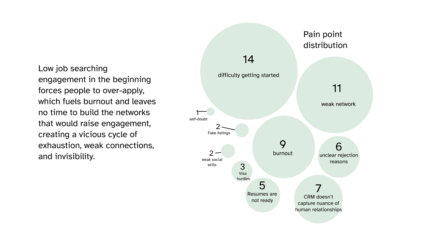
We began by speaking with over 34 individuals who are undergrad and recent graduates to better understand their pain points around networking. From this research, common themes quickly emerged:
RESEARCH
Defining the MVP with Product Stakeholders
Working closely with the Product Owner, our goal was to define a Minimum Viable Product (MVP) that would offer real value while being feasible for a first launch.
The focus -> create a product that solve most common pain points to gain traction without overbuilding.
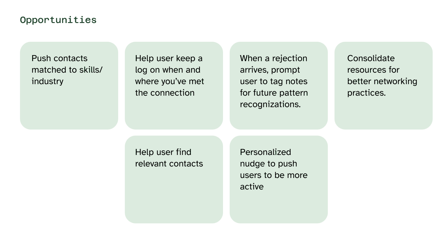
To do this, we mapped the user journey to identify moments where our tool could intervene and help. We wanted to support users not just in one-off interactions, but in building sustainable, networking habits.
We have discovered several opportunities to solve user pain points. We are going to generate insights to create early features:
SYNTHESIS
Features we decided on and their purposes
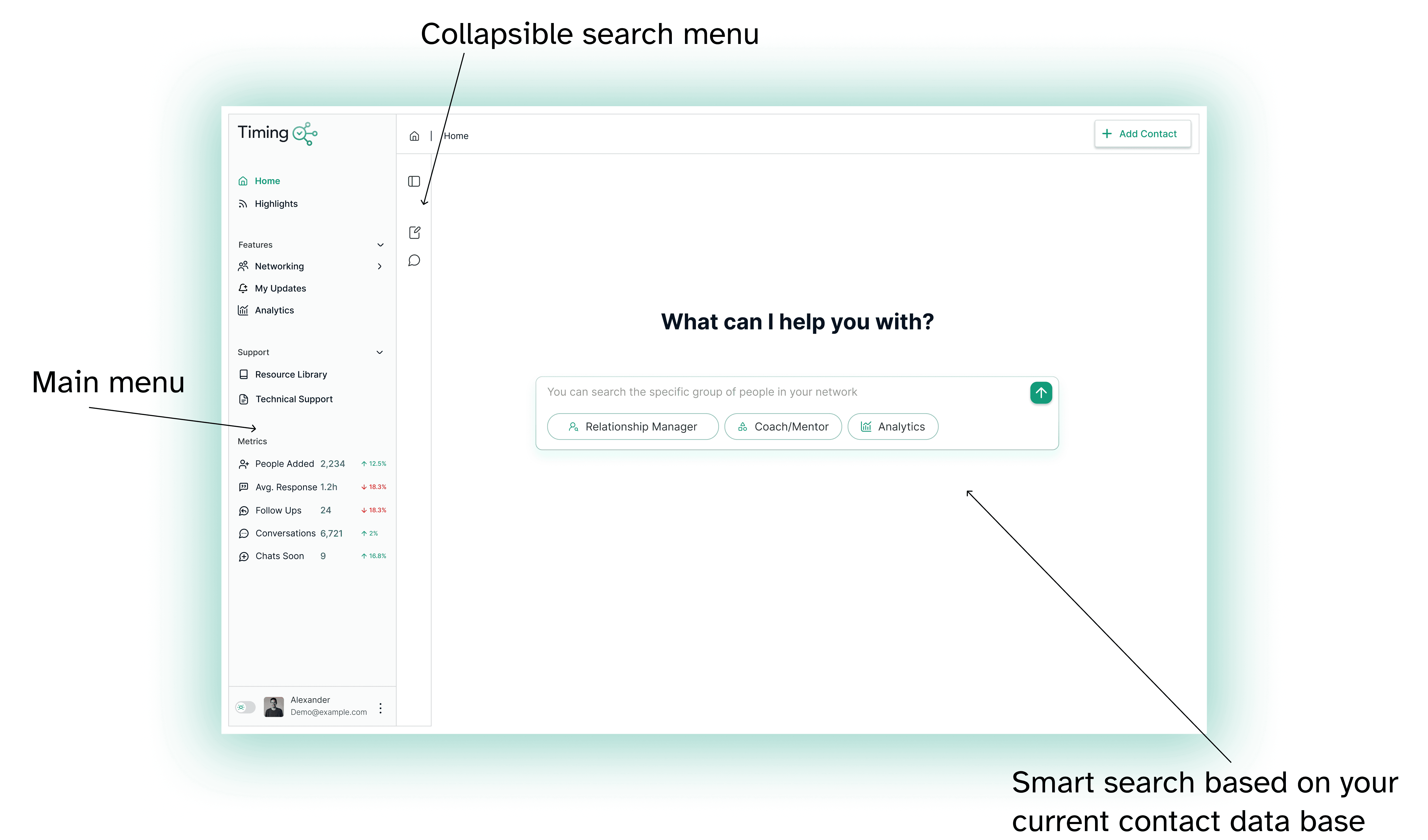
🔍 AI Search – Smart search to quickly find relevant contacts from your current network data base
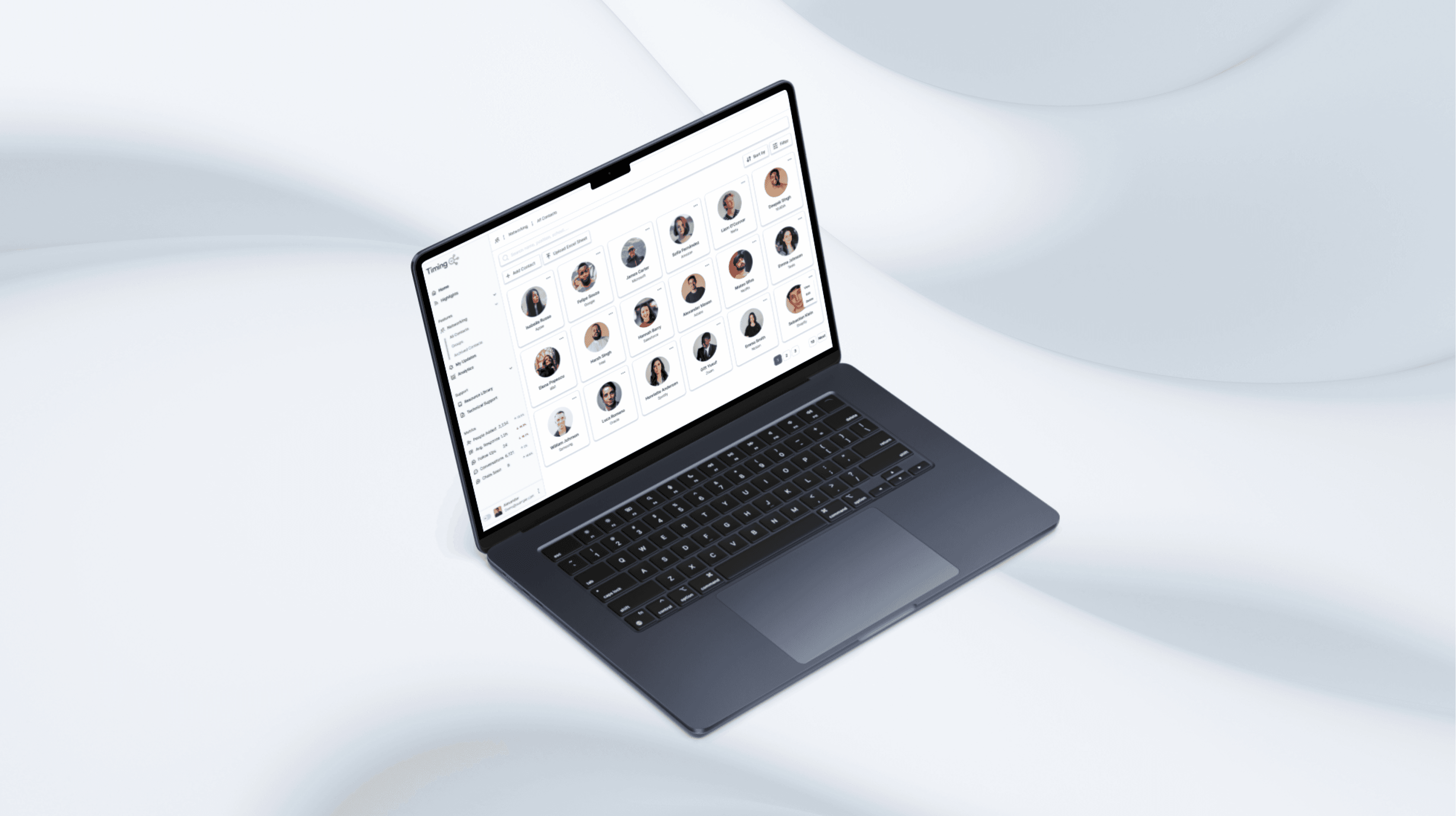
📇 Network – The core contact manager: add, tag, edit, and organize your connections
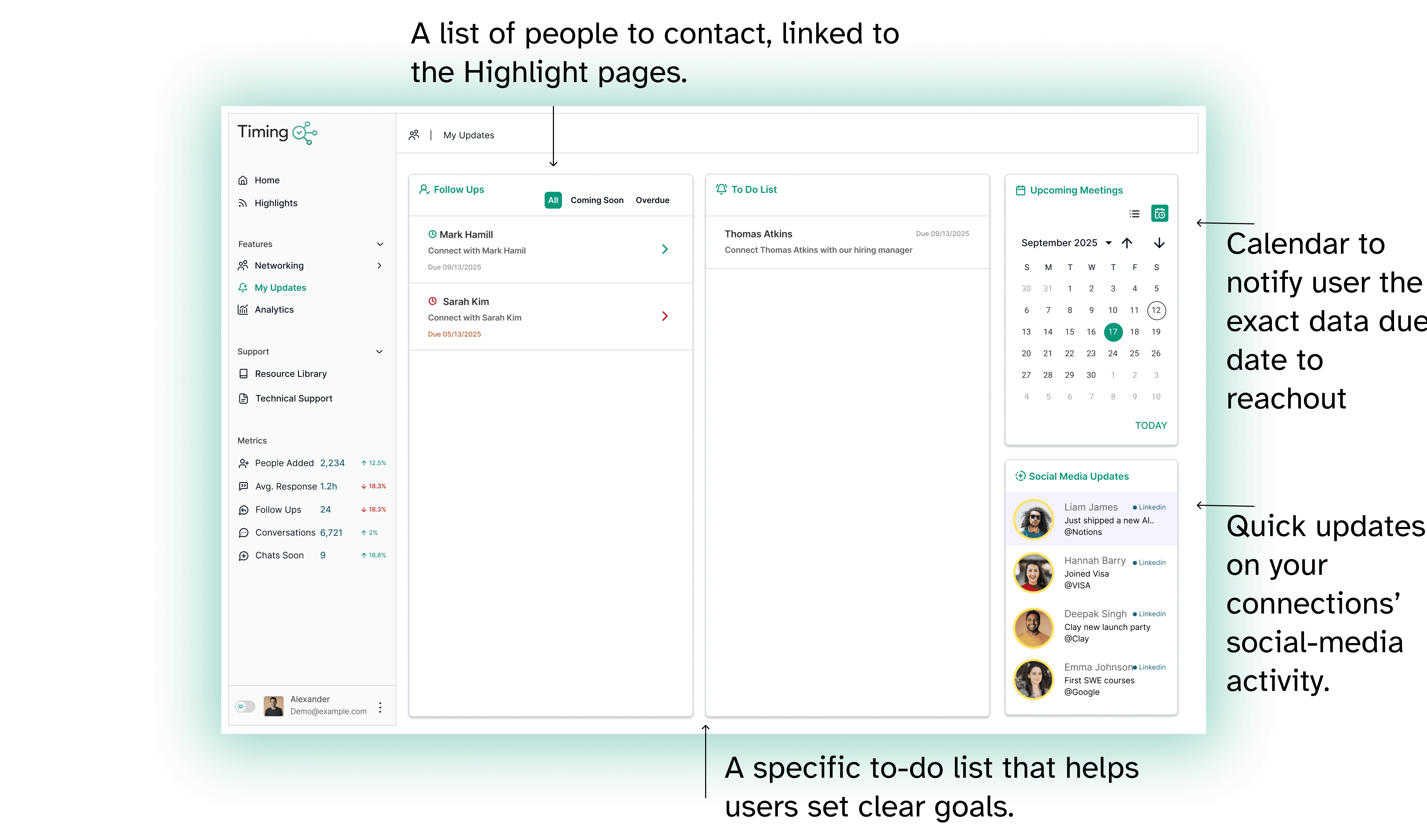
🔔 My Updates – Personalized reminders and prompts for timely follow-ups
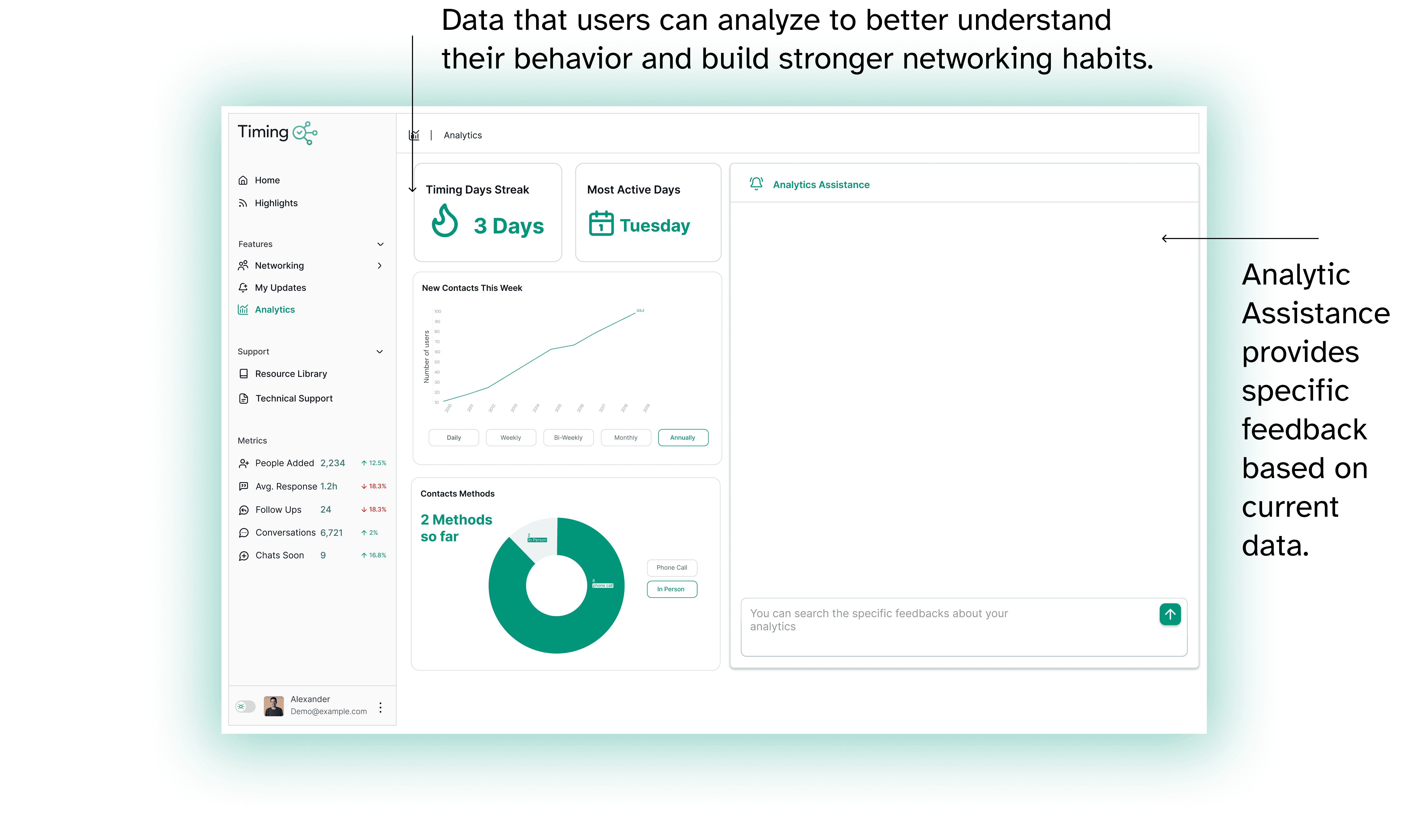
📈 Analytics – A dashboard showing your networking activity over time
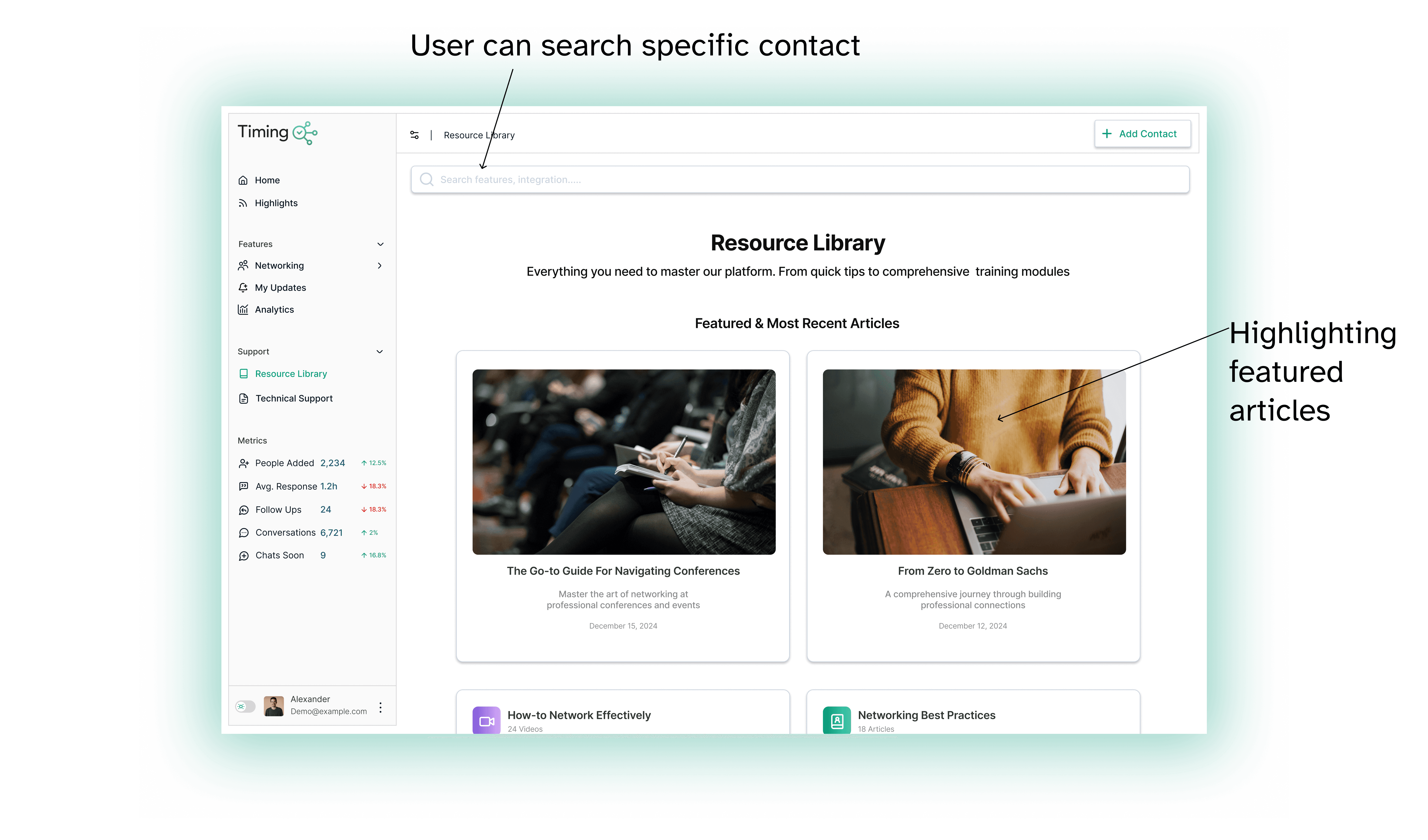
📚 Resources – Curated tips, templates, and articles to level up networking skills
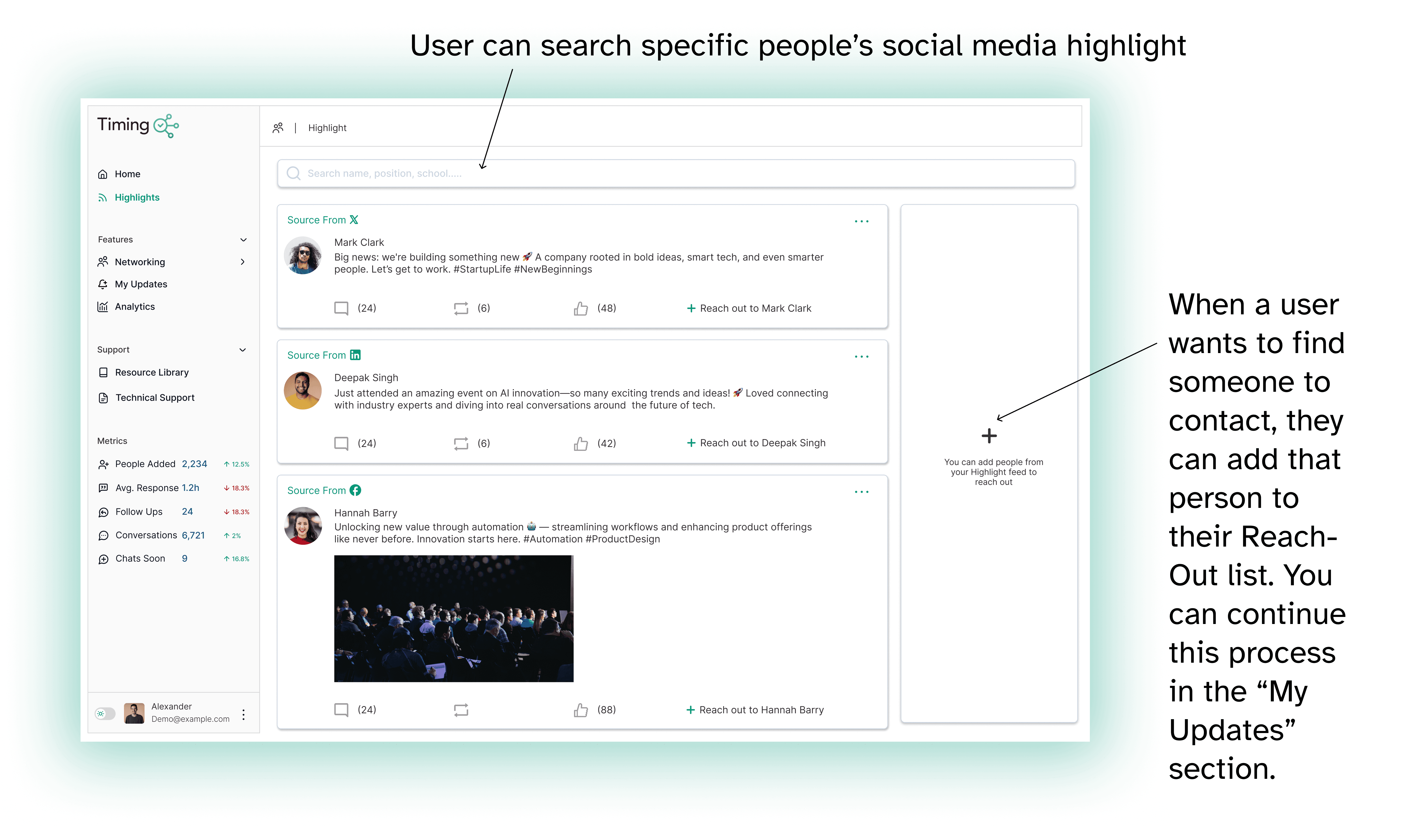
🌟 Highlights – See updates from your contacts so you have something meaningful to reach out about
SYNTHESIS
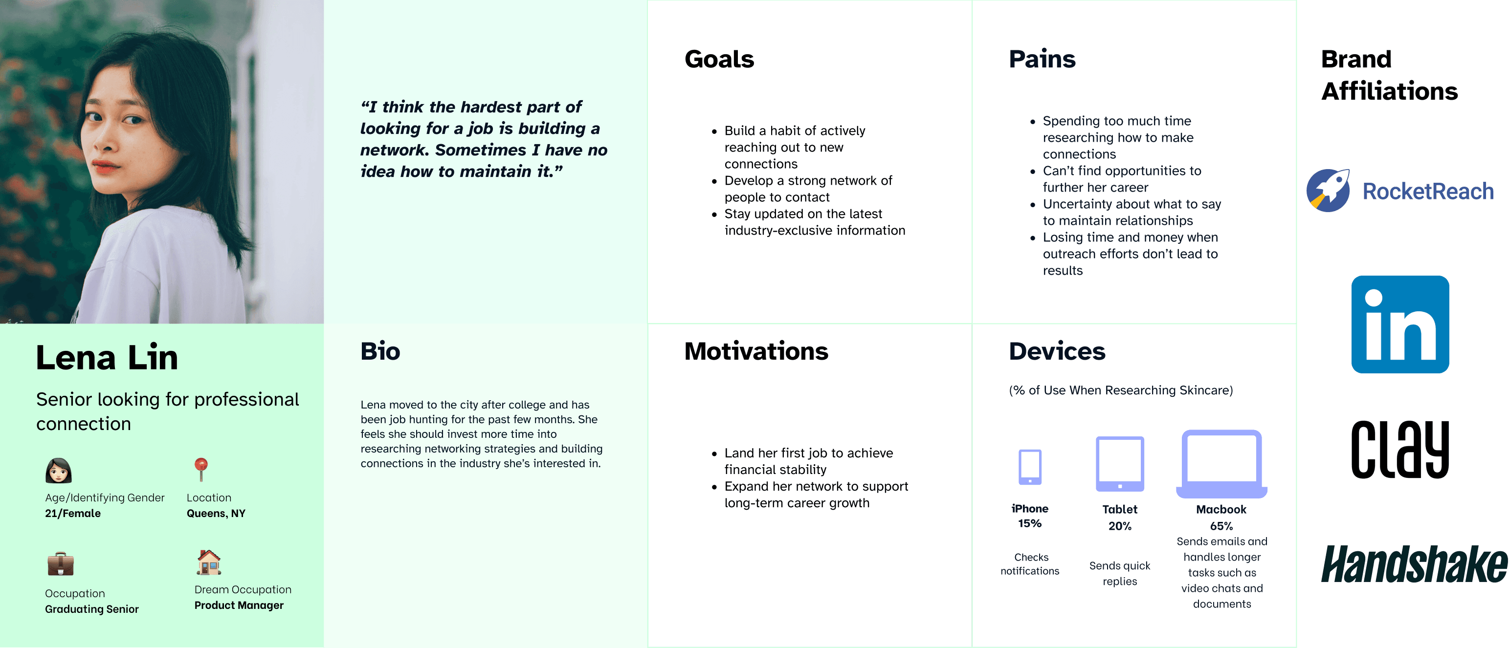
Personas
IDEATION
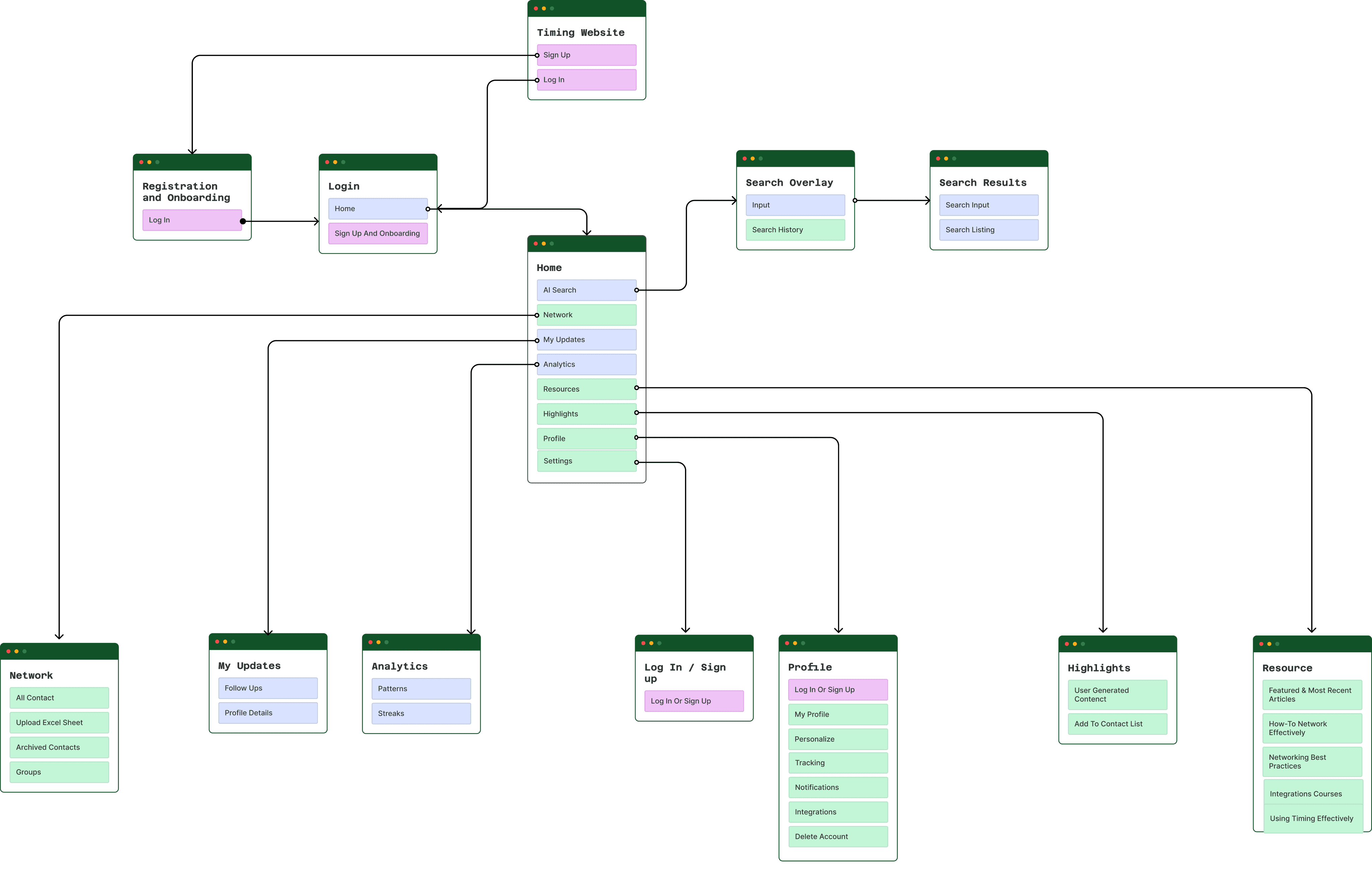
Sitemaps
Our information architecture was intentionally designed around a left-side menu layout to keep navigation consistent.
IDEATION
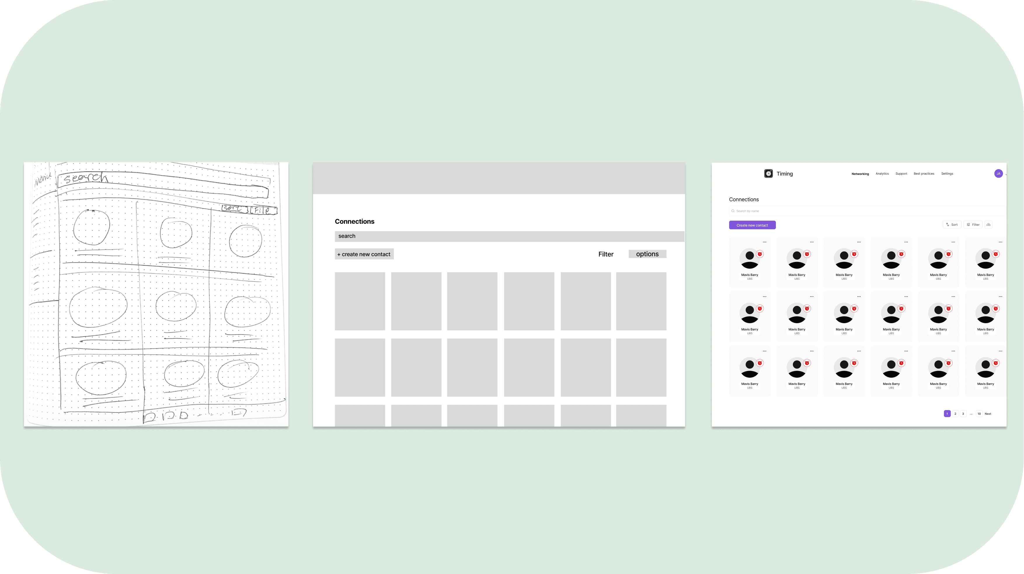
Initial Design -> Wireframing
We started the process by creating lofi-sketches to see which options would be good for coding. We consulted dev team about the AI capability, and to see how can we incorporate that into technical flow. After validating the flow, we moved into mid-fidelity wireframes, we focused on clarity and usability. Several rounds of feedback helped refine the layout and interaction patterns.
IDEATION
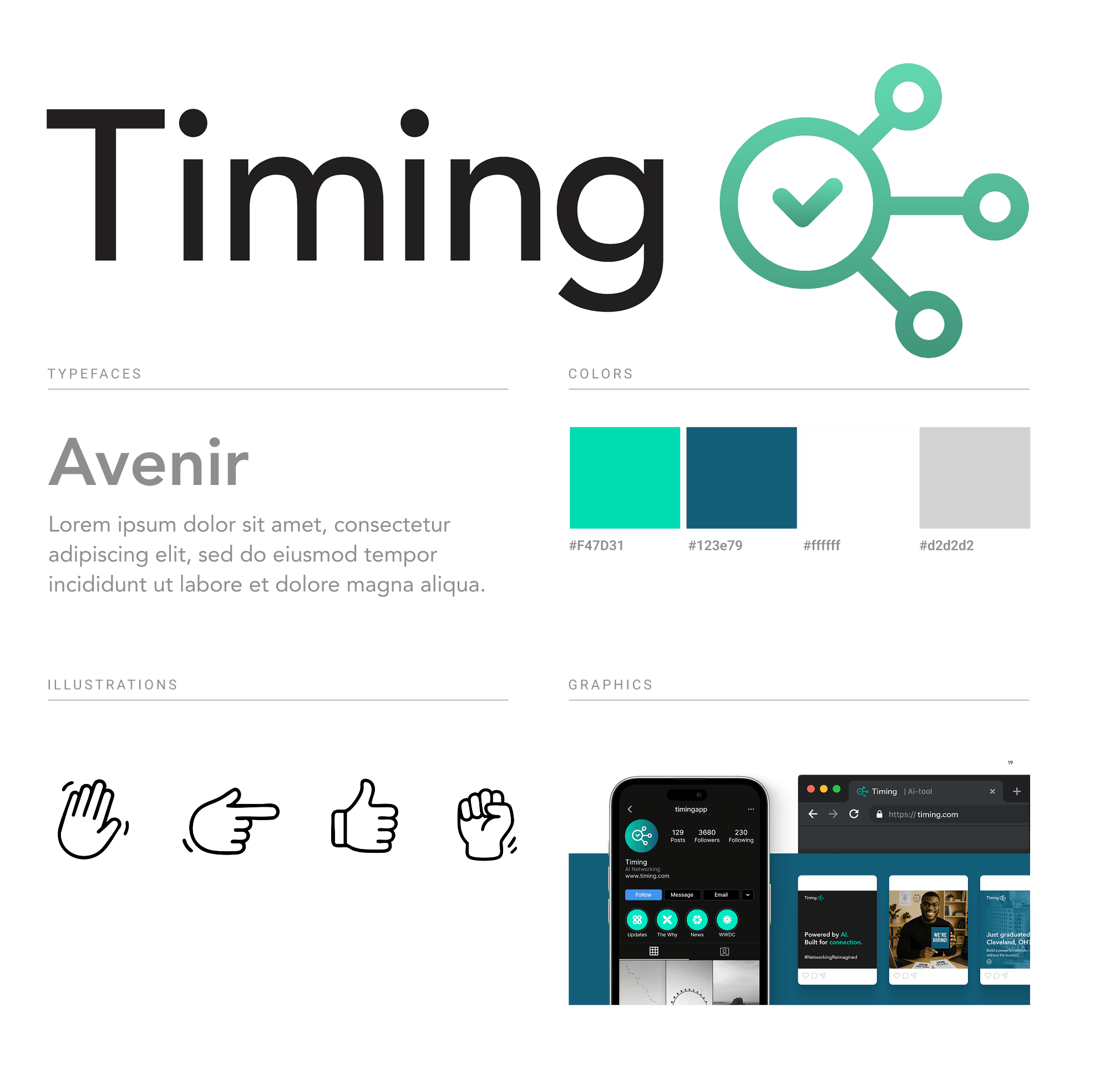
Branding
While we received a base brand identity from a freelance designer, I refined the color palette to ensure better contrast ratios and WCAG compliance, improving overall accessibility and legibility.
IDEATION
Solution
We brought it all together with a polished UI and clickable prototype that covered all major features:
AI Search
Network

My Updates
Analytics
Resource
Highlight
ITERATION
Does it work? Time To Do Some Usability Research
We decided to invite several users to test our new designs by completing a set of tasks. At the end, we’ll ask follow-up questions to assess their satisfaction and overall experience.
Test Criteria
We will look at
📊 Completion Rate – Tracks the percentage of users who successfully finish key tasks in the flow
⏱️ Time to Complete – Measures how long it takes users to complete a task, helping identify friction points
🚧 Drop-Off Points – Highlights where users are exiting or getting stuck during the experience
💬 Confidence Score – Captures how confident users feel after completing each task. We will also ask them to score their outcomes.
Key Insights
What worked
Users successfully added contacts and accessed the Resources section.
What didn't work
Organizing content was difficult.
The Highlight Sections and Analytics features were hard to use on first encounter; clearer onboarding is needed.

ITERATION
Design Changes
Improve information architecture to make organization easier.
Provide feature-based onboarding flows for new and complex features.
NEXT STAGE
Current Constrain
After 6 months of design and iteration, work on Timing was paused due to financial constraints and technical limitations. While the concept showed strong potential, sustaining development proved challenging without the necessary support and infrastructure.
NEXT STAGE
Key Takeaway
Despite positive feedback, sustaining a product requires stable financial and technical foundations.
Feedback gathered during our tests helped validate core features and revealed what users found most helpful.
Pausing isn’t failure. Knowing when to pause allowed us to reflect on what worked, what didn’t, and what we’d do differently next time.